1 comment
219 views

Everyone knows that advertising today has been changing at an exceptionally fast rate. This includes church advertising. It used to be that the chief means of letting a newcomer to your city or a weekend visitor know about your church was through the yellow pages or the Saturday newspaper. Well, in Grand Rapids, for example, the religion section is now on Thursday (there is no longer Saturday home delivery). And I just looked our latest Yellow pages directory, and only three churches have ads that stand out in white in the church section. Advertising now is all about websites and Google-ads (and other creative computer-driven ideas).
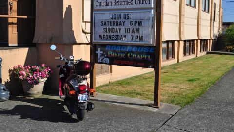
One advertising means hasn’t changed, however: the church sign that people see as they drive by. The traditional church sign had the name of the church, the times of the service, the name of the pastor (perhaps), and maybe a listing of the Sunday sermons(s). I have long felt that there is a far better way to use the space available on the church sign, and that is with a changeable caption that causes people to take notice. At least, I admit I have noticed churches with interesting and thought-provoking captions on their signs far more than signs that blend into the landscape. That is why, a number of years ago, I wrote a small book about Your Church Sign and gave between 1,000 and 1,100 possible captions (as well as idea on how to use the captions effectively).
We had had such a sign at the Woodland Drive-In Church since the late 1980s. I regularly changed the caption once a month (because of distance I live from the church and the time it took to remove the old letters and to put the new ones on, I did not change it more frequently). But technology changes, and about a year ago we installed a sign where I can now change the captions on a computer from our location. I actually have the option of putting up as many as fifty captions per week to cycle one by one. (I usually choose from four to six.)
My goal behind the captions is to bless and/or challenge the people who drive by with words. I have a regular default caption that has our website along with the time and temperature. I almost always have at least one familiar Scripture verse on the sign. During the Christmas season, I will have the first one or two lines of a familiar Christmas carol (to counteract the “Santa songs” and “sleigh bells” that play on car radios). I rotate between evangelistic captions, captions about God being in charge of this world, seasonal captions, captions on prayer, captions on reading the Bible, etc. Each caption stays on for five minutes (that is a city of Grand Rapids regulation), but because it is located on a corner with a traffic light, over the course of a week most people (I think) see the whole rotating group each week.
Frankly, I have had more comments now on our church sign than I have ever had before we went digital. It is now the number one reason why people notice the Drive-In church and decide try it out for a Sunday. By carefully choosing captions (I will have more to day about this in a later blog), you can say a lot about the “soul” of your church and its ministry. What effective ways are you using in this digital age to let people around know where your church is and what you stand for? What interesting or striking church sign captions do you remember seeing?
Church Admin & Finance, Children's Ministry
Church Admin & Finance, Children's Ministry
Church Admin & Finance, Church Communications
Church Admin & Finance
Connect to The Network and add your own question, blog, resource, or job.
Add Your Post
Comments
Our sign has been without power for over a week, and I don't miss it at all. I don't miss the simplistic moralisms, the guilt trips, the superior sneering at those unchurched motorists who drive by every day. Not all of the sayings were of that nature, but far too many were. Our church sign is some kind of a witness, but too often it is negative and ineffective, perhaps even counter-productive in reaching out with anything approximating "good news." This post is a reminder that as pastor I have to take control of this and put it back into the hands of those who think about our outreach. It is also a reminder that such signs have to be part of a well-considered, intentional ministry to our community. Our sign was simply donated by a member, with no mandate or reflection upon how it would be used, and since it was donated, we presume we have to use it, right? I will be looking forward to the next installment, on carefully choosing captions. But our sign is technogically limited; it can only display one short line at a time, which means people driving by see one half of a message, and have to crane their necks to see the first or second part...not exactly a safe situation. I would prefer the time and date and "Welcome to our Worship" to what we have had. But I have not put it high on my priority list; this year I won't have that excuse any more. I think the first rule with these signs has to be "do no harm."
Let's Discuss
We love your comments! Thank you for helping us uphold the Community Guidelines to make this an encouraging and respectful community for everyone.