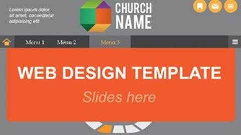
You’ll often hear people say custom designed websites will always be better for an organization than using a template. There’s an argument to be made for that, but often the reality in many churches is the lack of budget for something custom.
A quality template based site can be an option, but it takes work to pick the right one. So if your church is looking to build a website using WordPress, (a free, open source content management system with low-cost, customizable template style themes) or some other private company, here are some tips for making sure you get a website that’s functional for your needs.
- Set goals and priorities before ever looking at a template. What do you want people to do on your site? Who are the audiences? What are the important features? How do you want to present your church? A lot of the work you do when creating a website comes in the planning stages. Just because you’re using a template doesn’t mean you can skip the planning. Without it, you end up stuffing a lot of information into a site that doesn’t work for you or your end user.
- Find a template that meets your identified needs. Once you’ve done the planning, then you can start looking at designs and companies. Does a template have a homepage layout that lets you dedicate the right amount of space to the priorities you want to communicate? Do the subpages let you customize content to fill your needs? If you want to upload sermon audio, does this template easily allow it? Just because a template looks cool doesn’t mean it’s going to serve your church well. For example, if the template dedicates half of the homepage to a big image slider box and you don’t have the content to fill it, that’s a problem.
- Know the look and feel of your church. What is your color palate? What style best represents your church? The goal of a website is to make it feel like someone is walking into your church for the first time. You want your website to match who you are in person. One of the biggest problems with template sites is picking something that looks really nifty but feels nothing like the real experience of physically going to your church. If this happens, there’s a disconnect with visitors and there’s a question of whether they can trust you.
- Understand how your template works on mobile devises. If a template you like doesn’t have a feature rich mobile version, don’t buy it. Mobile functionality is a top priority. If the site defaults to something plain that doesn’t let you share your key content in a compelling way, it’s not the right option. Increasingly, it’s easier to find templates, especially in WordPress, that use responsive design. This type of design scales to the size of the screen someone is using without the loss of major functionality or design. (Here’s a post I wrote awhile back on responsive design.)
- Find something that has flexibility. Even within a template, there should be some level of flexibility in what features you can add or change. Also, look for something that grows with you. If you decide to expand what you’re doing online can you do it easily without having to start from scratch? It’s awful to think about spending so much time developing a site just to shut it down and reload your content into a new system a few years later. Using a WordPress theme may take a little more technical work, but there are so many different plugins and other options that let you easy add new features.
- Know the real costs. Template sites can seem like a good deal. You pay a small amount upfront and plug in all your content. But some companies charge a hefty fee for monthly hosting and the rights to use their proprietary content management system. Plus any sort of design help or technical support is extra. In some cases, it’s better to pay more for a custom design with updates every few years than to constantly pay monthly fees.
Your church website is too important to ignore. It takes money, budgeted yearly, to make it happen. A tight financial situation doesn’t mean you have to end up with something that doesn’t fit your needs or doesn’t represent who you are. Be thoughtful and picky. After all, as I’ve said many times, your website is your church’s new front door.
If you use a template based site, what was your process for picking the final design? Was it the right decision?

Comments
I love studiopress, it is SO flexible. I use it on several of my blogs and websites.
Those look good. Perfect timing, as my church is looking at making a change. Thanks for the blog post, and for this particular lead.
Let's Discuss
We love your comments! Thank you for helping us uphold the Community Guidelines to make this an encouraging and respectful community for everyone.