Moving Beyond Pictures Of Empty Buildings
2 comments
43 views

I’ve been spending some time randomly looking at church websites lately. I’ll Google a common church or denomination name and just start clicking. The process leaves me inspired, laughing and frustrated all at the same time.
As I paged through websites, there were a few things I noticed about the images churches decide to use. And there are a few common themes where some minor tweaks would make a big difference.
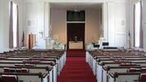
Your church is more than your building. Page after page, I saw pictures of building exteriors, steeples and empty sanctuaries with no other picture to be found. Yes, we are often proud of our buildings. Yes, they are often times icons in our communities. But a picture of a building alone tells me nothing about what you stand for as a church. What does your congregation look like? What are they doing for the community? Where do your passions lie? Show pictures of your people. If you show your sanctuary, do it when people are there. It’s okay to have a picture of your building, but don’t make it theonly imagery. Work through whatever policy you want for posting pictures of people, but do it. Your church in action tells a much more compelling story than the exterior of your building.
Even a small image can make a big impact. We often give the advice that putting a face to a story is more compelling than just writing a bunch of text. It’s easier to connect when you feel like you know the person in a story. That’s why I really liked what Monyhull Church did. They had a testimony from a young woman in their church. It was in her own words. And right beside the text was a picture of her smiling face. It’s simple, but it added emotion. People will always trust other people more than they trust an organization. Put a face on the good things that are being done in your church.
Just any random picture isn’t enough. I applaud churches that work to add images to their website. It’s a step in the right direction. But it is uber-important to be intentional about the pictures you’re choosing. The first picture I saw on one church website was what I can only imagine to be a spirited committee meeting. There were people around the table with one guy standing and pointing his finger at the others. No one looked happy. It made me uncomfortable and I don’t even go to that church. Is an angry committee really the image you want to share? Do you really want people to say that this is a church that spends all their time sitting in meetings? Be intentional about what impression your photos are making.
Pictures on websites are important and I think they’ll become even more predominant in the future. Newly developed websites I’m seeing now are giving a lot more real-estate to image. Some, like Pathway Community, Blytheville Hills Baptist, First Euless and a redesign coming from Monyhull, stretch all the way across the screen.
Pictures tell stories in a way words alone cannot. Challenge yourself to use more images and be intentional about picking pictures that give a real feel for who you are. Visitors will be more engaged and members will have a site they’re excited to share with friends.
Church Communications
Church Communications
Church Communications
Connect to The Network and add your own question, blog, resource, or job.
Add Your Post
Comments
Something I've noticed in similar website roving is that churches often use 'stock' pictures of people who look happy enough, but a) looked so professional that they likely were originally ad pictures or studio pictures and b) don't look anything like the people form the church represented.
It is surprising, especially since it seems like every church would have at least one budding amateur photographer who would love to volunteer to take some more candid photos. It could even be a fun youth project - images of our church, or something.
Let's Discuss
We love your comments! Thank you for helping us uphold the Community Guidelines to make this an encouraging and respectful community for everyone.